On Hebrew Types and Writing Styles
by Rafael Frank
To a far greater extent than during the Renaissance, today's scholars are engaged in the study of Hebrew and Aramaic, two closely related Semitic languages that also share a common alphabet. And these scholars are not only the Christian theologians, who, in Jewish writings, seek and find insight and a better understanding of the Galilean rabbi and the era in which he lived. New discoveries in the Near East, like witnesses of a highly developed cultural world rising from their grave, have also made linguists and historians recognize that the correct interpretation and evaluation of these discoveries depend on sufficient knowledge of the fundamental languages that were formerly native to that region. One of these is, relatively-speaking, still very much a living language and is preserved in today’s Hebrew.
This newly-awakened interest in the Hebrew language not only necessitates more intensive work in the field of typeface production, but also broadens the use of Hebrew type beyond merely printing Bibles, ancient Hebrew literature, grammars, prayer books and, in Eastern Europe, devotional books, magazines, and daily newspapers. How Hebrew is used must also be considered with regards to a movement that is already prominent and will undoubtedly impose its own demands on the black art [printing]. I am referring to the Zionist movement, which seeks to use spoken and written Hebrew to nurture and disseminate the idea of a national homeland for the Jewish people. At the end of my remarks, I will return to the aspects which should be decisive for a redesign of the Hebrew typeface, and I hope to be able to demonstrate that it is important for book lovers and all those involved in the book trade today to become familiar with both the development of the Hebrew typeface as well as its goals.
It is neither my task nor my intention to discuss the invention of printing and the contribution Jews made to it, particularly to its dissemination; I will only mention in passing that there have been historical theoreticians who sought to trace the earliest seeds of this invention back to the time of the Second Temple. In the Talmud, various priestly families, who jealously guarded certain preparations for sacred service as family secrets, are rebuked by the rabbis for this secrecy. One priest, Ben-Kamzar, knew how to write the four-letter name of God with four fingers of his hand in one stroke. Now, some claim that Ben-Kamzar accomplished this by using four stamps, an assertion that could gain some credence when one considers the ancient Chinese stamp prints and the block prints that preceded the invention of movable type.
Although Jews were not directly involved in Gutenberg's invention, either in practice or in theory, they—unlike the church, which dominated at the time—eagerly embraced the new art to spread their treasured writings, the one thing that they could save through all the epochs of hardship. They immediately recognized that they could use printing to counteract the confiscation and burning of books, which was then a common practice of the Church and its secular allies.
The following hymn by an unknown author is taken from the colophon of one of the earliest Hebrew prints. The English translation reads as follows:
I write without a stem or shaft,
I arrange the lines to leave no gaps,
I complete the book without the skill of a scribe.
Deborah, who still gapes at the scribe's stylus,
Would have risen in awe.
And fashioned from me a shining diadem.”
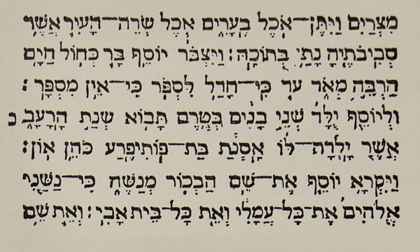
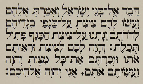
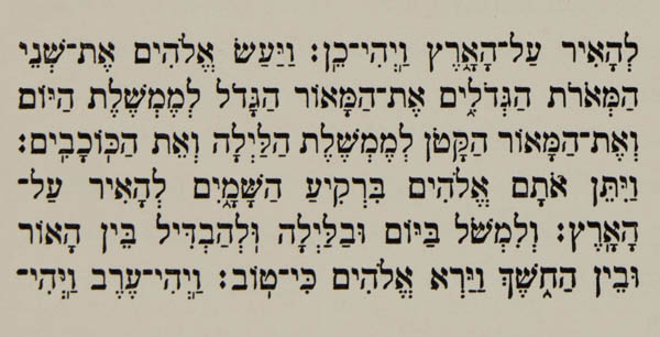
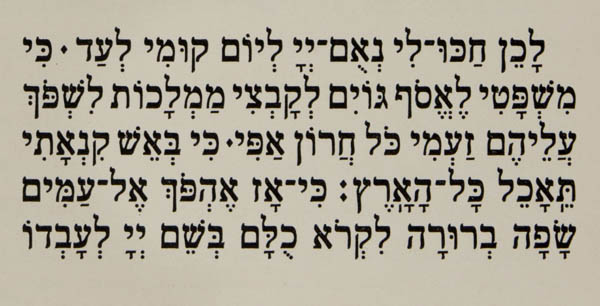
If we consider 1450 as the year of Gutenberg's invention, the fact that more than 100 Hebrew incunabula are now known certainly warrants great recognition. The earliest known work is a biblical commentary by Rashi, printed in 1475 in Reggio di Calabria (Figure 1). (This was even before Greek type had been used in letterpress printing.) The facsimile of this type can be found in Brockhaus’ Konversationslexikon (under letterpress printing). It shows this typeface — still set without vowel signs — a very angular letterform that already is within the vertical 3:4 rectangle that I have advocated and which was later realized in Frank-Rühl. The stark contrast between thick horizontal and thin vertical strokes which appeared later and persisted until recent times is also entirely absent from these letters. A print —another incunabulum—produced in 1488 in the workshop of the earliest known Jewish printer, Gershom Soncino, already features the vowel signs and diacritical marks set under the letters (Figure 2).
Only those familiar with Hebrew typesetting can appreciate the significance of this development. We have hardly made any progress in this regard — or should it not be considered as tremendously backward that the addition of vowels is still not generally practiced?
When I speak of early prints, I am referring first of all only to those in square script (Meruba). The old type shows its origin in [the writing of] the reed pen (κάλαμος) most faithfully. The style of the letters resembles that of our Rotunda; the reed pen or goose quill do not allow for calligraphic finesse.
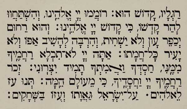
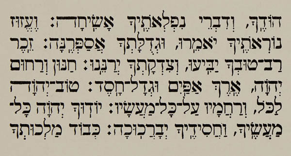
After only a short time, however, the type acquired a form that is admirable in its perfection, and which we know from the workshop of Daniel Bomberg in Venice (Figure 3). It is touching to learn how the rabbis and authors who worked with him refer to their Christian publisher as the most noble Mr. Daniel Bomberg of Antwerp יצ״ו (that means: may his refuge and redeemer protect him); an honorific that was otherwise reserved only for Jewish dignitaries and men of great merit.
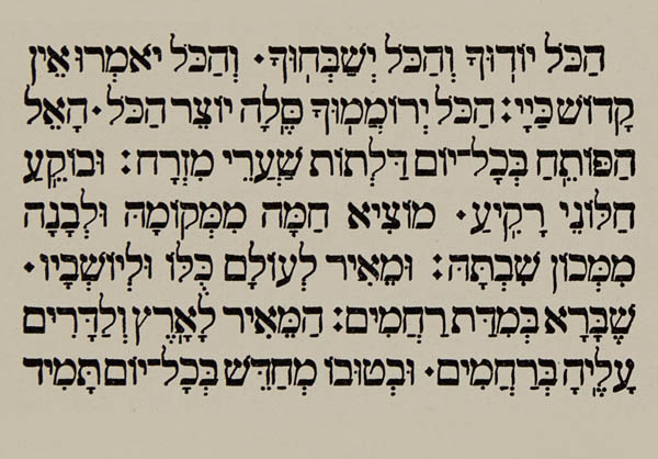
Bomberg's type has never been surpassed. Whatever the Amsterdam (1700) and Heidenheim (1800) typefaces (Figure 4 and 5), which were based on Bomberg’s designs, gained in clarity, they lost through the introduction of an excessive contrast between basic and hairline strokes, a feature that departed considerably from the Safrut style.
Another remarkable feature of Bomberg's prints is their clean, pitch-black impression and the paper, which has remained still crisp and white today even after 400 years. I do not believe that those who come after us in the year 2300 will enjoy the prints we produce in the same way.
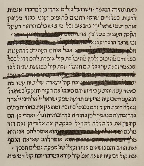
It may be regarded as an ironic joke played by contemporary history that today the immaculately black letters shine forth from beneath the faded lines of censorship (Figure 6).
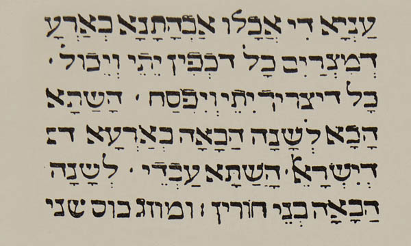
Parallel to Bomberg’s type, a Fraktur developed in Basel, Cologne, and Prague prints, whose style adheres closely to handwritten forms, yet whose beginnings and edges clearly show the woodcutter’s knife (Figures 7 and 8). The letterform in this case falls within the proportions of a horizontal rectangle (5:4). We find the last remnants of this Fraktur in recent prints from Vienna and Pest (Figure 9). In the latter, the letterform has indeed again moved out of the rectangle and back into the square, but the contrast between thick and thin strokes has been carried to extremes. The height of tastelessness and lack of style was reached with the typefaces produced by the Association of Jewish Teachers of Germany. What was attempted for educational purposes, is indeed partly achieved through the cartoonish drawing of similarly formed letters but while also creating new opportunities to confuse them. Because of its tangled and fussy appearance, the type is completely unsuitable for use in schoolbooks. (Figures 10 and 11). Since the chairman of the association conceded to me in a reply that the commission for letter design lacked any artistic and expert advisory board, we shall leave these types to their fates and turn to those that may currently be regarded as the most impeccable. I consider the typeface made by Drugulin to be among them and—if I may add, based on authoritative opinions—the newly issued Frank-Rühl. We may describe the Drugulin typeface as a crystallization of the Vilna typeface, on which, to the best of my knowledge and belief, it was based, and recommend it as exemplary to those who wish to examine this typographical tradition (Figures 12 and 13).
If I may now say a few words pro domo about Frank-Rühl Hebrew, which I designed and which is discussed in this volume and was cut in 12-point. I will limit myself to highlighting the considerations that guided me in its design and that, in my view, represent the minimum requirements for a modern Hebrew typeface that remains traditional in form.
The trend in the modern book industry to create a typeface that combines the simplicity of Antiqua with the appeal of Fraktur has also led to the demand that the stark contrast between heavy horizontals and light verticals in Hebrew faces give way to a more balanced and harmonious structure. Such a typeface, made with strict adherence to traditional form, would ensure greater readability through calmness and consistency.
In modifying the style of the Hebrew typeface, entirely different considerations must be taken into account than when stylizing an alphabet that is not used for religious purposes. The modern type designer lacks any responsibility for his fanciful creations; his work is judged solely by public acceptance or rejection. It is different for those who draw Hebrew letterforms. For them, there is a permanent authority in place.
In its specifications on how to write Torah scrolls, the Shulchan Aruch, this codex of Jewish law [the permanent authority referenced above], sets forth the strictest standards governing the form, structure, and composition of each individual letter. As early as 1515, a liturgical question arose in Salonika: should printed Hebrew texts be accorded the same degree of sanctity and reverence as handwritten ones? In summary, the ruling concluded that they should not be regarded as having the same level of holiness and that certain ceremonial materials were not be printed.  This decision may well have been made because the earliest printed letterforms could not reproduce the calligraphic forms of handwritten script.
From that point on, the development of type followed its own path, yet never without regard to the characteristics of the written letter, except, unfortunately, in the case with the aforementioned Association of Jewish Teachers of Germany.
This decision may well have been made because the earliest printed letterforms could not reproduce the calligraphic forms of handwritten script.
From that point on, the development of type followed its own path, yet never without regard to the characteristics of the written letter, except, unfortunately, in the case with the aforementioned Association of Jewish Teachers of Germany.
The sofer, or torah scribe, today still writes with a goose quill, using ritually prepared ink and parchment, exactly copying the Masoretic text and in accordance with rules prescribed in the codex. In order to practice his art, the sofer must obtain authorization from rabbis adhering to the strictest interpretation of Jewish law.
In designing my alphabet, I drew on the style of the earliest prints, particularly the Venetian ones, and made only the most necessary changes to distinguish similar-looking letters for educational purposes. When, as was inevitable, Christian scholars—no less vigilant than rabbis in ensuring the preservation of traditional letterforms—questioned me about one or another deviation from the norm and seeming liberties, I was always able, as a certified sofer, to justify my design decisions, and I have had the, for me, pleasant experience of finding that the scholars in question accepted my explanations (Figure 14).
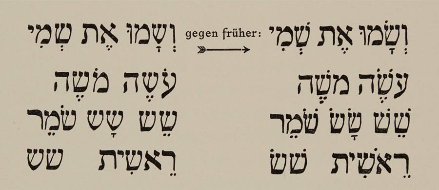
When I describe Frank-Rühl as a healthy reform, I do not mean to conceal the fact that I have not yet achieved the goal that I have set for myself and that I still envision. That would be the inclusion of vowels signs in the line. The principle for this can already be found in classical literature, where the four letters אהוי (matres lectionis) are used as vowels. Then, as in Ethiopian script, the letter could also carry its own vowel within itself. I have also considered omitting the diacritical dot used to distinguish between שׂ and שׁ (Figure 15).
On the other hand, I believe that by adding the cholam in correct relation to the consonant to which it belongs, I have done a genuine service to the art of typesetting, as well as to education [ compared to earlier times
 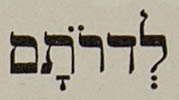 ].
].
The calmness and stability of my type are further ensured by the fact that none of the little heads, of which many letters often have several, is placed askew אצש. The more robust vertical lines have finally exorcised the twisted, jellyfish-like shapes from the type and the letter embodies a self-contained totality in which all its parts are evenly balanced in weight.
So far, I have spoken only and exclusively of Meruba. It is well known that Jews possess several other alphabets in addition to square script, all of which derive from Meruba. Some, especially the cursive forms, are difficult to trace back to it, certainly in those cases where either foreign influences (Arabic, Syrian or Greek) or even abnormal phenomena have interfered with how they evolved over time. So, for example, to write the for the
 must have the same underlying aberration as the widely depicted
  for
for  .
.
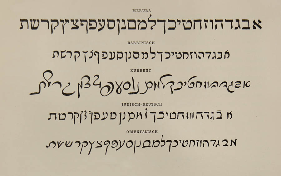
Within the limits of this presentation, I can refer only to those alphabets that are geographically closer to us, i.e., those used in Rabbinic [writings], so-called Jewish-German, and secretary hand, and even then, only briefly. There are almost as many of these as there have been host countries for the dispersed Jewish people. Just as we are familiar with Yiddish, for example, in which the German language is written with Hebrew characters, so, too, exist examples of Hebrew with Persian characters, Persian with Hebrew characters, and so on, in countless and endless variations.
I cannot pass over Yiddish too quickly, for I know that this language elicits an amused smile from the listener. Yet, I believe I could read a bit of a medieval chronicle with the same effect, since, without its Slavic, Latin and Hebrew influences, Yiddish is nothing other than the form of German that medieval Jews took with them on their way through Germany to the European East. They preserved this form of German, and there is evidence that many word stems and inflections still used in Yiddish have long since disappeared from modern High German, though they continue to pop up in Flemish and Dutch. There are, of course, grammars of Yiddish and the vernacular and anyone interested will at once recognize their similarity with Middle High German and Old High German. (Compare lēbĕndīg.)
At the end of the examples of my handwriting reproduced on page 25, I have added an alphabet. For a long time, I flattered myself with the thought that I had designed it, until I realized that it corresponds almost exactly to the Moroccan-Oriental alphabet. It is precisely on this alphabet, however, that I think a modified Hebrew alphabet, designed specifically for use in printing, should be based. Such a typeface should reflect the character of Meruba in its basic outlines and strict simplicity, while its style should also display the uniformity and consistency characteristic of Latin Grotesk. A much appreciated, further improvement would be the elimination of all overshoots (ךןףץל).